Tabs are UI elements that allow multiple contents within a single window. Tabs are used as a navigation for switching between sets of content. With tabs, it is possible to keep a large amount of data in a much smaller area than you usually need.
| Tabs macro | ||||||||||||||||
|---|---|---|---|---|---|---|---|---|---|---|---|---|---|---|---|---|
| ||||||||||||||||
[{"label":"Tab 1","id":"1","content":{"version":1,"type":"doc","content":[{"type":"paragraph","content":[{"type":"text","text":"Test1232323l2ojkdslkjdslkdsjdslkdsj"}]}]},"icon":""},{"label":"Tab 2","id":"2","content":{"content":[],"type":"doc","version":1},"icon":""}] |
Example
| Tabs macro | ||||||||||||||
|---|---|---|---|---|---|---|---|---|---|---|---|---|---|---|
| ||||||||||||||
[{"label":"What are tabs","id":"1","content":{"version":1,"type":"doc","content":[{"type":"mediaSingle","attrs":{"layout":"center"},"content":[{"type":"media","attrs":{"type":"external","url":"https://caelor.atlassian.net/wiki/download/attachments/303366145/Screenshot%202022-08-12%20at%2017.21.16.png?version=1&modificationDate=1660549025122&cacheVersion=1&api=v2"}}]},{"type":"paragraph","content":[{"type":"date","attrs":{"timestamp":"1658448000000"}}]},{"type":"panel","attrs":{"panelType":"info"},"content":[{"type":"paragraph","content":[{"type":"text","text":"Info"}]}]},{"type":"table","attrs":{"isNumberColumnEnabled":false,"layout":"default"},"content":[{"type":"tableRow","content":[{"type":"tableHeader","attrs":{},"content":[{"type":"paragraph","content":[{"type":"text","text":"User Story","marks":[{"type":"strong"}]}]}]},{"type":"tableHeader","attrs":{},"content":[{"type":"paragraph","content":[{"type":"text","text":"Requirements"}]}]},{"type":"tableHeader","attrs":{},"content":[{"type":"paragraph","content":[{"type":"text","text":"Scope"}]}]}]},{"type":"tableRow","content":[{"type":"tableCell","attrs":{},"content":[{"type":"paragraph","content":[]}]},{"type":"tableCell","attrs":{},"content":[{"type":"paragraph","content":[]}]},{"type":"tableCell","attrs":{},"content":[{"type":"paragraph","content":[]}]}]},{"type":"tableRow","content":[{"type":"tableCell","attrs":{},"content":[{"type":"paragraph","content":[]}]},{"type":"tableCell","attrs":{},"content":[{"type":"paragraph","content":[]}]},{"type":"tableCell","attrs":{},"content":[{"type":"paragraph","content":[]}]}]}]},{"type":"paragraph","content":[]}]},"icon":"atlaskit/ArrowRightIcon"},{"label":"When we use tabs","id":"2","content":{"version":1,"type":"doc","content":[{"type":"table","attrs":{"isNumberColumnEnabled":false,"layout":"default"},"content":[{"type":"tableRow","content":[{"type":"tableHeader","attrs":{},"content":[{"type":"paragraph","content":[{"type":"text","text":"Table","marks":[{"type":"strong"}]}]}]},{"type":"tableHeader","attrs":{},"content":[{"type":"paragraph","content":[]}]},{"type":"tableHeader","attrs":{},"content":[{"type":"paragraph","content":[]}]}]},{"type":"tableRow","content":[{"type":"tableCell","attrs":{},"content":[{"type":"paragraph","content":[]}]},{"type":"tableCell","attrs":{},"content":[{"type":"paragraph","content":[]}]},{"type":"tableCell","attrs":{},"content":[{"type":"paragraph","content":[]}]}]},{"type":"tableRow","content":[{"type":"tableCell","attrs":{},"content":[{"type":"paragraph","content":[]}]},{"type":"tableCell","attrs":{},"content":[{"type":"paragraph","content":[]}]},{"type":"tableCell","attrs":{},"content":[{"type":"paragraph","content":[]}]}]}]},{"type":"paragraph","content":[]},{"type":"codeBlock","attrs":{},"content":[{"type":"text","text":"Code"}]},{"type":"bulletList","content":[{"type":"listItem","content":[{"type":"paragraph","content":[{"type":"text","text":"Bullets"}]}]}]},{"type":"paragraph","content":[{"type":"text","text":"sasaassasa"}]}]},"icon":"material-design/AccessTime"},{"label":"Why we use tabs","id":"l7qpmpzgp","content":{"version":1,"type":"doc","content":[]},"icon":"bootstrap/CheckCircle"}] |
How to use
To add the Tabs macro to a Confluence page:
Choose “+” in the Confluence editor
Search “tabs” and select the MacroSuite - Tabs.
Alternatively, type '/' on the Confluence page to see a list of suggestions and type 'Tabs.' Intuitive configuration dialogue helps users to create and customize tabs fast and easily.
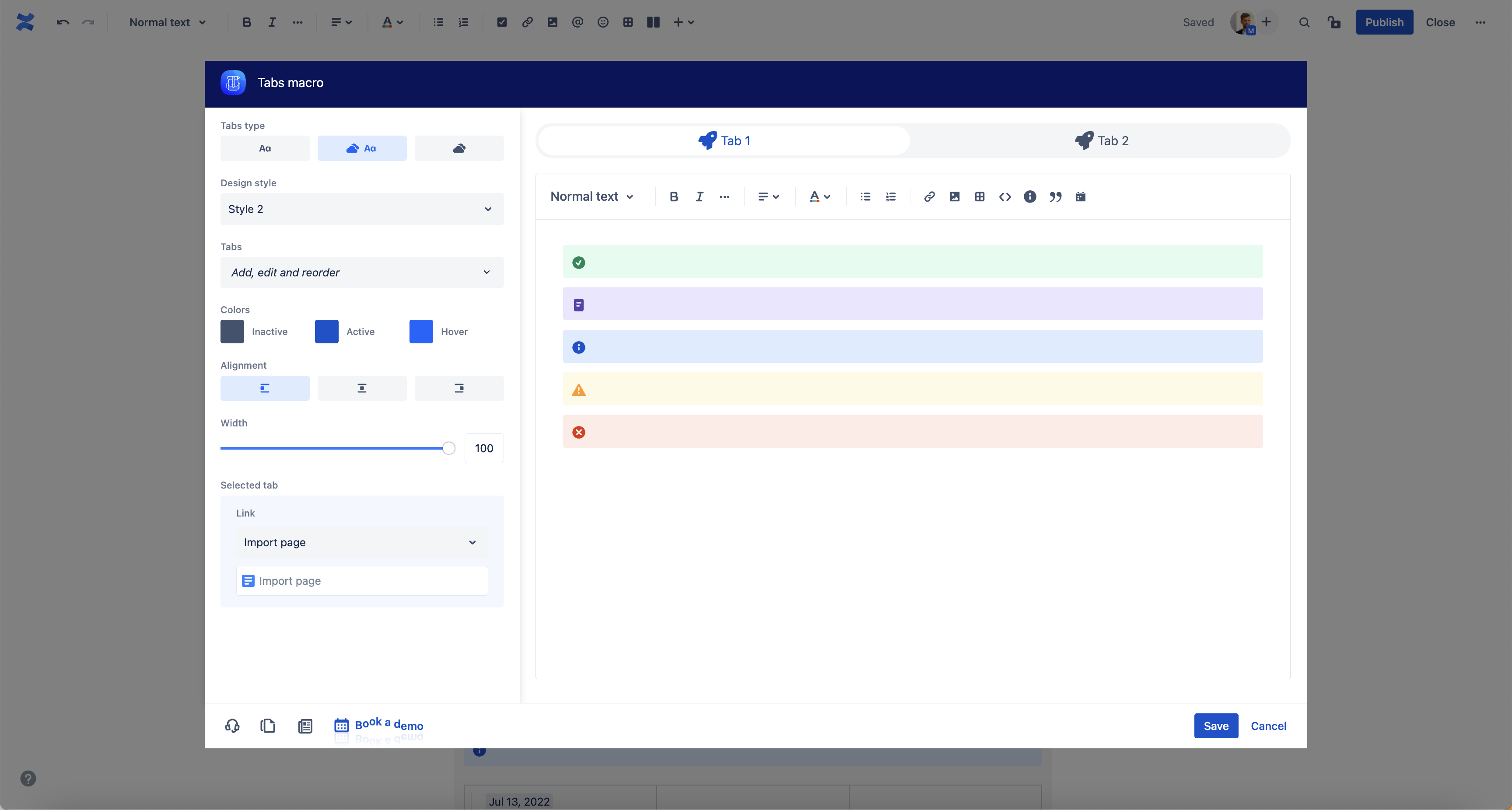
Tabs alignment | Select tabs alignment. By default, tabs are left aligned. | ||
Tabs styles | Choose from three different tabs styles. | ||
Create tabs | Use dropdown to create tabs. To change the icon and text, use inline editing option. | ||
Icon | Click on icon and choose from more than 5000 icons available and attract even more attention. To change the icon position or remove label, use the “Icon” dropdown in the macro configuration. | ||
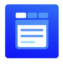
Editor | Most of the native Confluence macros are available within the tabs editor.
Supported macros:
| ||
Import Confluence pages | Use the option to add and edit whole Confluence pages within the tabs macro. |
Roadmap
The Tabs macro will receive updates to improve performance and user experience. We will introduce the following features soon:
Colour and font configuration (active, inactive, and hover)
Status colour Green title RELEASED! Tabs width
Status colour Green title RELEASED! Preview mode with configuration options
Status colour Green title RELEASED! Add and manage action points and decisions in tabs
If you have any questions, need more detailed information, or want to share feature suggestions, please feel free to contact us via our service desk.
| Button macro | ||||||||||||||||||||||||||||||||||
|---|---|---|---|---|---|---|---|---|---|---|---|---|---|---|---|---|---|---|---|---|---|---|---|---|---|---|---|---|---|---|---|---|---|---|
|
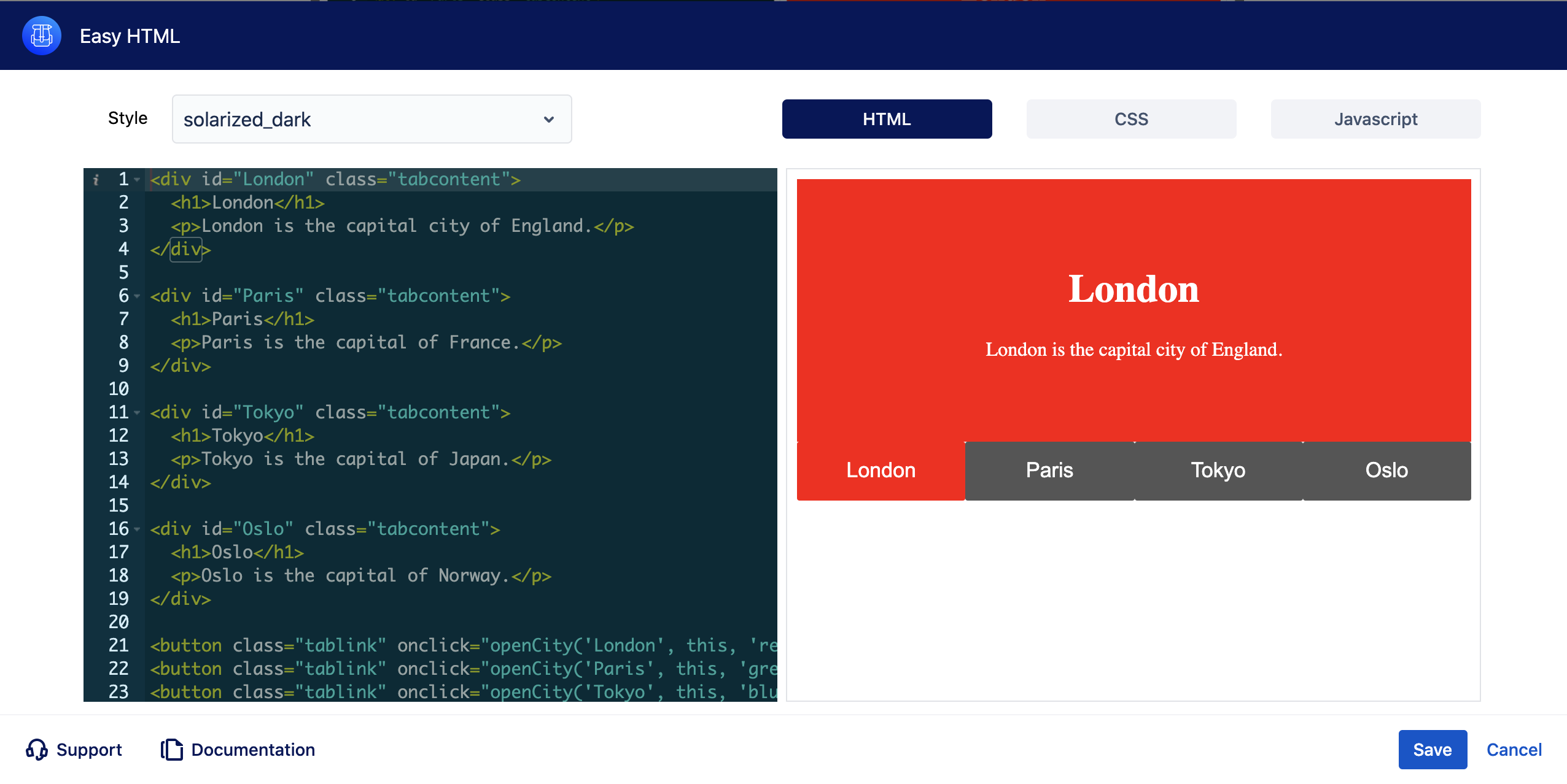
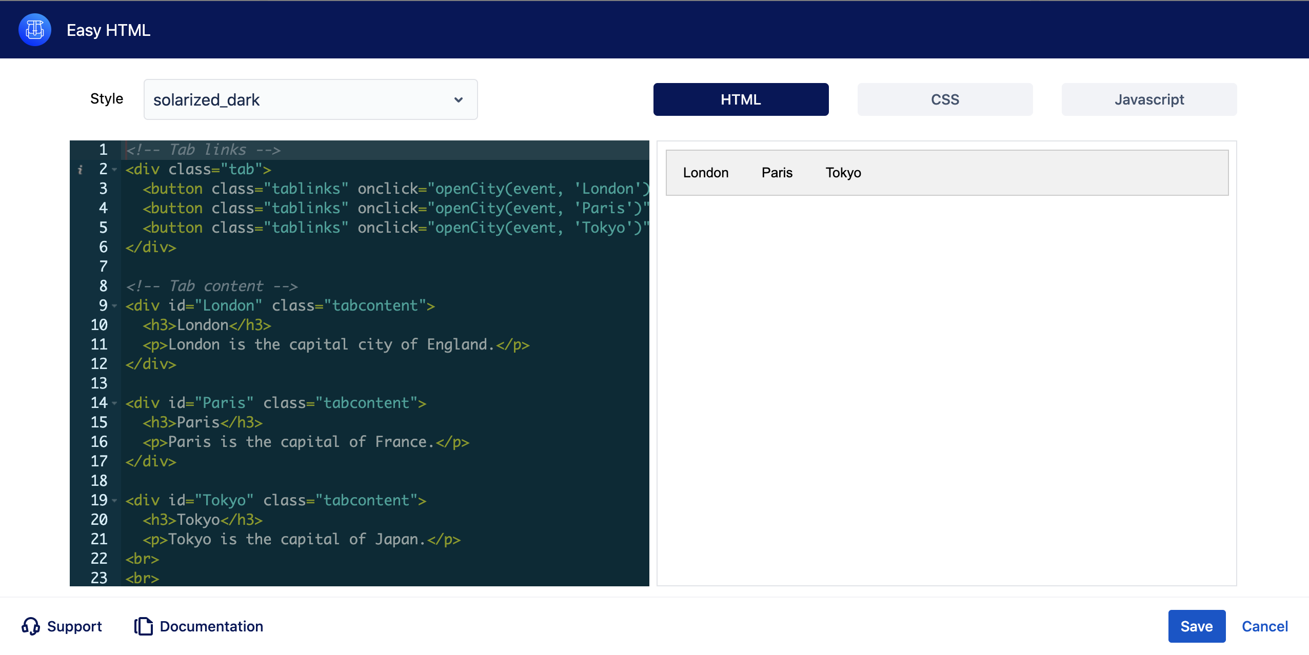
Tabs with Easy HTML
Tab headers
| Easy html macro | ||||
|---|---|---|---|---|
| ||||
Hover Tabs
| Easy html macro | ||||
|---|---|---|---|---|
| ||||