Overview
Catch your readers attention with Cards! Highlight the content in your boxes to ensure more structured and easy to read Confluence pages.
Card macro
To add the Card macro to a page:
In the Confluence editor, choose + > Other Macros
Find and select the Card macro.
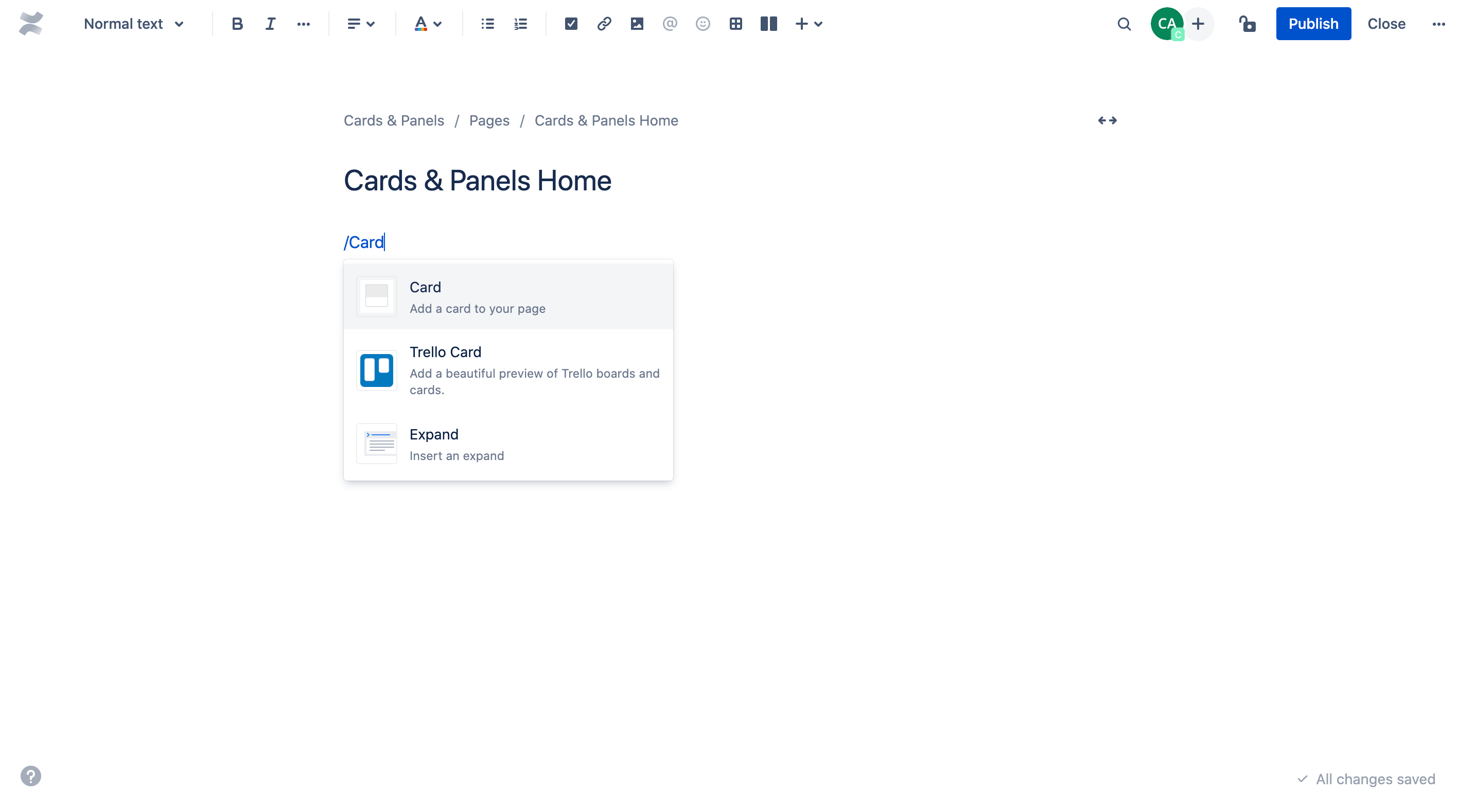
Alternatively, just type ‘/' and the beginning of an element (tool or things in the insert menu) to see a list of suggestions and enter 'Card’.
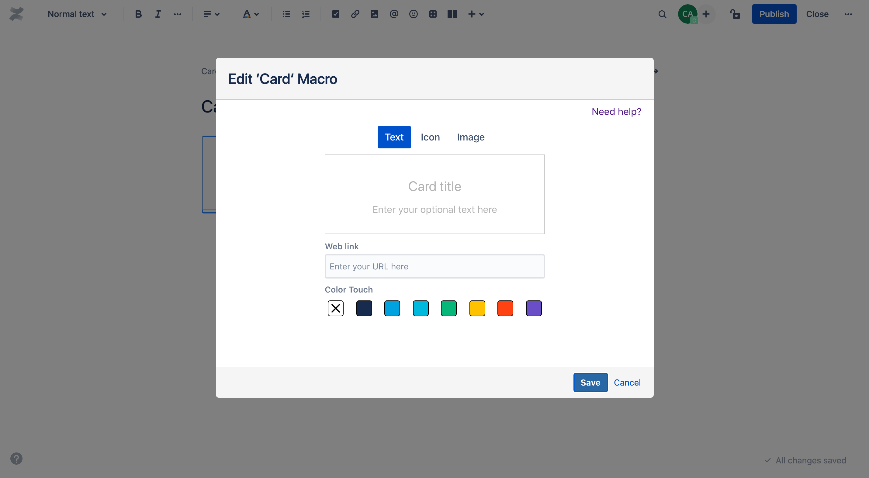
The Card configuration dialog opens up and presents you a variation of Card types:
Basic
Text
Icon
Image
Content
People
Pages
Spaces
Templates
Banner
Basic cards
Basic cards are best used to direct users' attention to essential sections of your page. You can use multiple cards within one Card macro and adjust them by using the Layouts tool.
Text
The simple option to highlight the content that is most important to you.
You can add an optional title and text. By hovering over a card you can do following adjustment:
Delete card
Apply link
Add colour
Background
Bar (at top of the card)
Icon
Bring more attention to your cards with icons.
You can add an optional title and text. You can also select an icon by browsing or seraching easily for specific icons by entering keywords in the search bar.
By hovering over a card you can do following adjustment:
Delete card
Apply link
Add colour
Background
Bar (at top of the card)
Icon
Image
Individual images will provide you with outstanding cards.
You can add an optional title and text. You can also select add an image by clicking on the default visual and pasting an individual image URL.
By hovering over a card you can do following adjustment:
Delete card
Apply link
Add colour
Background
Bar (at top of the card)
Define image position
Top
Bottom
Right
Left
You can reorder individual Cards position by dragging and dropping them. Depending on the selected layout one Card macro can contain a maximum of 8 cards and two rows. The text colour is automatically adjusted - black or white - based on the colours you are using.
Content cards
Content cards are incredibly useful when trying to link different content types within Confluence that is updated automatically.
People
Show off your team.
Just enter the name of up to 10 individuals per Card macro who have a licensed account on your Confluence site.
Pages
Promote Confluence pages you are proud of.
The Pages Card contains the following:
Page title
Author (of the linked page)
Short teaser text (taken from the top of the linked page)
Last change date (of the page)
The Page Card is automatically linked to the Confluence page.
Spaces
Build a helpful directory for any use case.
The Spaces Card contains the following:
Space name
Space avatar
The Spaces Card is automatically linked to the space dashboard.
Templates
Templates are pre-defined and highly individual cards intended to be used for specific use cases.
Banner
When you need to get the message across.
You can add an optional title and text. You can also paste an individual image URL or apply a URL.
Outlook
Cards will receive updates to improve their stability, performance and functionality. The following features will be introduced to Cards soon:
More templates
Several UI and UX improvements
Easier way of adding dynamic content
In case you have any questions, need more detailed information or would like to share feature suggestions, please feel free to contact us via our service desk.