Page Divider.mp4Introduction
Page A page divider is a layout element that helps organise organize and separate content into clear groups, sections, options, or parts. It helps you to make a page layout more clearer and readable for users.
.gif?version=1&modificationDate=1656345897242&cacheVersion=1&api=v2&width=680) Image Added
Image AddedLines are the most used UI element for separating the pieces of content and sections because they are recognised recognized easily in this role. Page Divider macro allows you to add a style or title to your page dividers and make your pages more attractive.
Examples
| Macrosuite divider macro |
|---|
| dividerWidth | 100 |
|---|
| dividerType | text |
|---|
| emoji | {"id":"smile","name":"Smiling Face with Open Mouth and Smiling Eyes","short_names":["smile"],"colons":":smile:","emoticons":["C:","c:",":D",":-D"],"unified":"1f604","skin":null,"native":"😄"} |
|---|
| textColor | #0052CC |
|---|
| dividerWeight | 3 |
|---|
| labelPosition | middle |
|---|
| textAlignment | left |
|---|
| iconColor | #0052CC |
|---|
| fontSize | medium |
|---|
| text | Left |
|---|
| emojiEnabled | false |
|---|
| dividerColor | #0052CC |
|---|
| dividerIcon | font-awesome/Rocket |
|---|
|
| Macrosuite divider macro |
|---|
| dividerWidth | 100 |
|---|
| dividerType | text |
|---|
| dividerWeight | 3 |
|---|
| textAlignment | center |
|---|
| fontSize | medium |
|---|
| text | Middle |
|---|
| textColor | #0052CC |
|---|
| dividerColor | #0052CC |
|---|
| dividerIcon | |
|---|
|
| Macrosuite divider macro |
|---|
| dividerWidth | 100 |
|---|
| dividerType | text |
|---|
| dividerWeight | 3 |
|---|
| textAlignment | right |
|---|
| fontSize | medium |
|---|
| text | Right |
|---|
| textColor | #0052CC |
|---|
| dividerColor | #0052CC |
|---|
| dividerIcon | |
|---|
|
| Macrosuite divider macro |
|---|
| dividerWidth | 100 |
|---|
| dividerType | text-with-icon |
|---|
| dividerWeight | 3 |
|---|
| textAlignment | center |
|---|
| fontSize | medium |
|---|
| text | Like |
|---|
| textColor | #00b779 |
|---|
| dividerColor | #00b779 |
|---|
| dividerIcon | fas/thumbs-up |
|---|
|
| Macrosuite divider macro |
|---|
| dividerWidth | 100 |
|---|
| dividerType | text-with-icon |
|---|
| emoji | {"id":"smile","name":"Smiling Face with Open Mouth and Smiling Eyes","short_names":["smile"],"colons":":smile:","emoticons":["C:","c:",":D",":-D"],"unified":"1f604","skin":null,"native":"😄"} |
|---|
| textColor | #6a4ec7 |
|---|
| dividerWeight | 3 |
|---|
| labelPosition | middle |
|---|
| textAlignment | left |
|---|
| iconColor | #6a4ec7 |
|---|
| fontSize | medium |
|---|
| text | Pinned Message |
|---|
|
| false | | dividerColor | #6a4ec7 |
|---|
| dividerIcon |
|---|
|
| Macrosuite divider macro |
|---|
| dividerWidth | 10070 |
|---|
| dividerType | text-with-icon |
|---|
| emoji | {"id":"blue_book","name":"Blue Book","short_names":["blue_book"],"colons":":blue_book:","emoticons":[],"unified":"1f4d8","skin":null,"native":"📘"} |
|---|
| textColor | #000000 |
|---|
| dividerWeight | 3 |
|---|
| labelPosition | middle |
|---|
| textAlignment | center |
|---|
| iconColor | #000000 |
|---|
| fontSize | medium25 |
|---|
| text | Documentation |
|---|
| textColoremojiEnabled | #00a2e0true |
|---|
| dividerColor | #000000#0052cc66 |
|---|
| dividerIcon | fasfont-awesome/boxesRocket |
|---|
|
How to use
 Image Removed dividerIn , choose + > Other Macros andFind divider macro ‘ and the beginning of an element (tool or things in the insert menu) enter divider’ dividers faster easier. Furthermore, with live preview, it is possible to show results in real-time without saving the configuration.
 Divider alignment | Select a page divider alignment. By default, the page divider is left aligned. |
Font size | Choose from three different divider font sizes: small, medium, or large. |
Divider type | Select a divider type: with icon or without. Both divider types have a title. |
Labe position | Label with icon can be placed under, above or within the divider. |
Title | Add a page divider title in the text field. The character limit is 40. If you need a page divider without a title, leave it empty. |
Icon | Set an icon with a click on the default icon and choose from the dropdown. Icon will appear only when the divider type with icon is selected. |
Divider weight 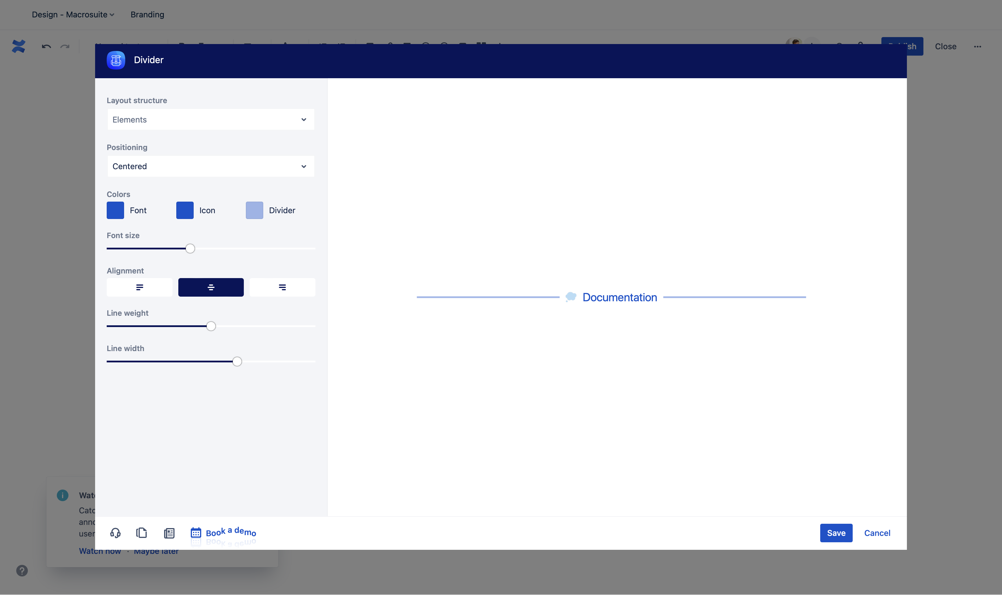 Image Added
Use the Layout structure option to enable/disable icon and text within divider. |
Use the positioning feature to place the content above or under the line. |
Choose a font, hover, and icon colors from the Atlassian primary and secondary colour palette. If you want to add more colours, use the HEX editor. |
Usean inline editing feature and seamlessly edit the content of your divider. Write your divider copy directly on-screen and make quick changes with one click. The character limit is 40. |
Click on icon and choose from more than 5000 icons available and attract even more attention with Atlassian built-in emojis. To change the icon position or remove label, use the “Icon” dropdown in the macro configuration. |
Use the slider to change the divider weight. |
Divider width | Use the slider to change the divider width. | Colour | Choose a page divider and icon/text colours from the Atlassian primary and secondary colour palette. If you want to add more colours, add a HEX value to the custom field. |
 Image Removed
Roadmap
The Page divider macro will receive updates to improve performance and user experience.
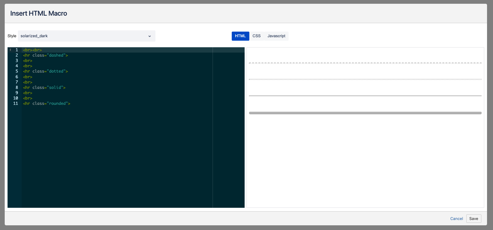
Different divider styles
Divider library
If you have any questions, need more detailed information, or want to share feature suggestions, please feel free to contact us via our service desk.
| Button macro |
|---|
| buttonText | Suggest new feature |
|---|
| isButtonShadowOn |
|---|
|
false| true | | buttonColor | #0252cc |
|---|
| buttonBorderColor | |
|---|
| buttonNewTab | true |
|---|
| buttonFontColor | #ffffff |
|---|
| buttonSize |
|---|
|
small| medium | | buttonWidthDetection | 260 |
|---|
| buttonIconColor | #ffffff |
|---|
| buttonHoverColor | #0252cc |
|---|
| buttonIcon |
|---|
|
material-design/ArrowForwardIos| fas/angle-right | | buttonType | icon_right |
|---|
| buttonNewLink | |
|---|
| buttonLink | https://caelor.atlassian.net/servicedesk/customer/portal/1/group/1/create/8 |
|---|
| buttonRadius | 20 |
|---|
| buttonShadow |
|---|
|
50
How to create Page Divider with Easy HTML
Learn more about Easy HTML
MacroSuite News
| Cp content card macro |
|---|
| data | {"type":"blog","variant":"grid","columns":1,"contributors":[],"labels":[],"spaces":[],"pagination":"carousel","enrichment":"dynamic","limit":"2","manuallyPicked":[],"_migrations":["migrateContentCards"]} |
|---|
|