Cards are a superpowerful UI component similar to playing cards in shape and size, intended to encourage readers to click or tap to view more details. A single card usually contains several elements, such as an image, a title, and a link, all connected to the same content. You can also think of it as a repository for related information that is at the same time easily accessible and eye-catching.
Without a doubt, cards have been a standard element of UI design for quite some time. Or, if you prefer fashion references, a little black dress of the UI design. 🙂 And there are valid reasons for it. They are simple, straightforward, clickable, easy to customize, and not to forget - dazzling! On top of that, using cards allows you to gather multiple pieces of information into one easily readable unit.
Examples
How to use
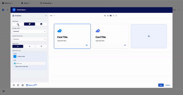
To add the Cards macro to a Confluence page:
Choose “+” in the Confluence editor
Search the “cards” and select the MacroSuite - Cards.
Alternatively, type '/' on the Confluence page to see a list of suggestions and type 'Card.' Intuitive configuration dialogue helps users to create and customize buttons fast and easily.

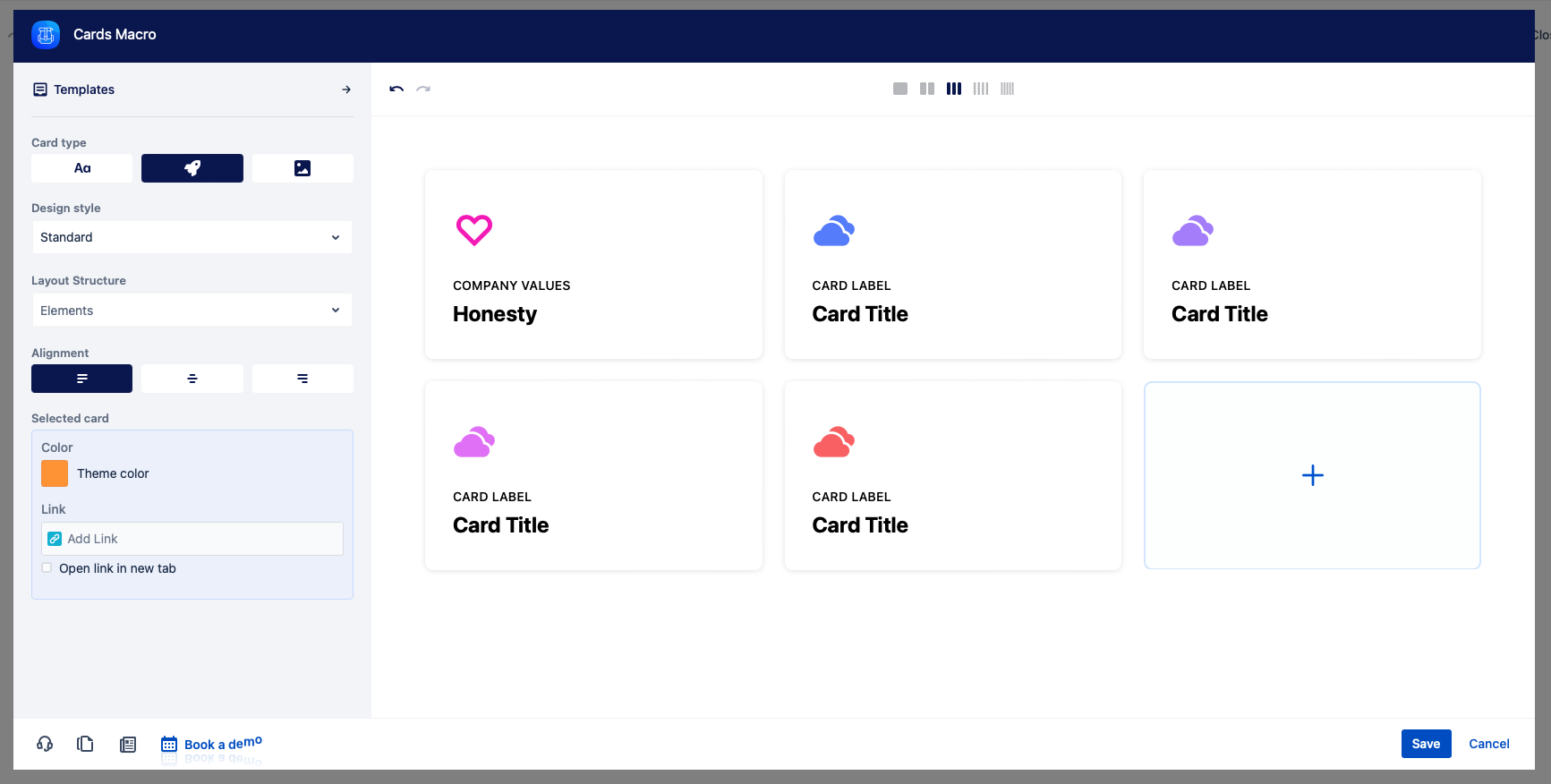
Inline editing | Use an inline editing feature and seamlessly edit the content of your cards. Write your cards copy directly on-screen and make quick changes with one click. There is no character limit. |
Icon | Click on icon and choose from more than 5000 icons available and attract even more attention with Atlassian built-in emojis. To change the icon position or remove label, use the “Icon” dropdown in the macro configuration. |
Color | Choose a theme color from the Atlassian primary and secondary colour palette. If you want to add more colours, use the HEX editor. |
Card Link | Add links to Confluence content (pages and attachments) and external URLs, giving them a more polished look. Use the email tab to open the mail client with the click on the button. |
Elements | Use the Layout structure option to enable/disable overline, title, line and text. By default, all elements are enabled. |
Design styles | The design style feature allows you to explore and play with different design styles until you find one perfect for your use case. Also, you get to select which elements you want to include and visually present in your cards. |
Card templates
For starters, let's welcome and give a big round of applause for our newly added Templates! Although our design team had a field day getting them ready for you, they are primarily (pre)designed to make your life and work easier. Save your time and creative juices and choose from a cool selection of Text, Icon, and Image templates.
Our UX/UI teams works on more button templates and categories. It is not possible to change or delete predefined templates. Use the library feature to create and maintain the company design guidelines.
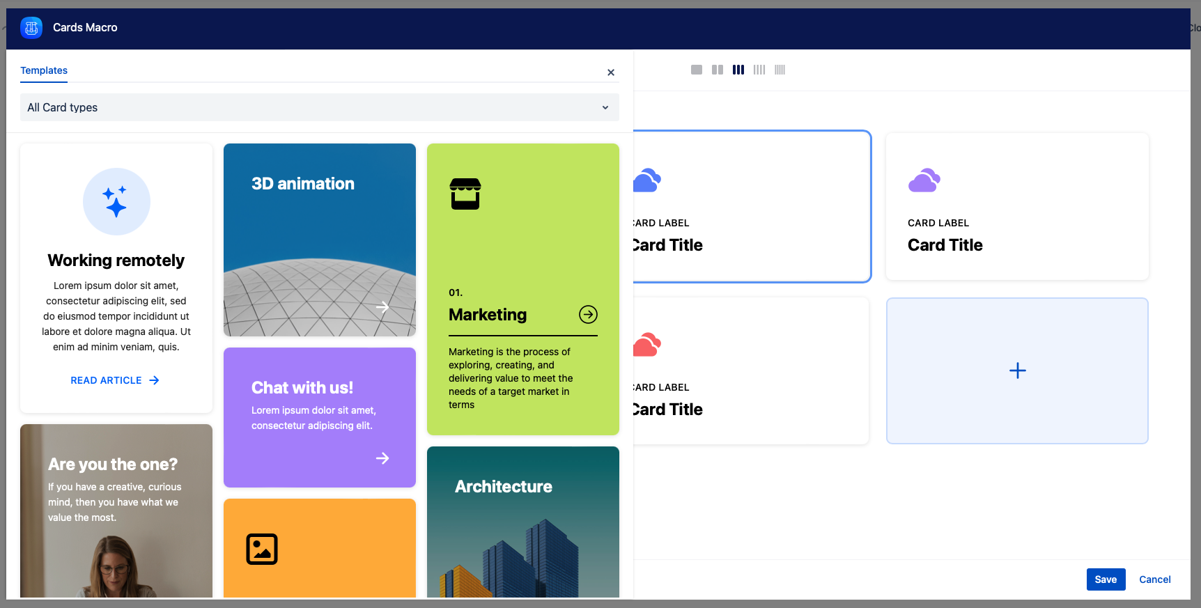
Of course, nothing is set in stone, so feel free to add your personal touch and further customize them to better suit your needs. And if you wish to show your work and share your creativity with others, you'll be glad to hear we're currently working on adding the Library section. The Library section will be available in the new release, and it will allow you to store all your custom-designed cards in one place. Oh, we've just spilled the beans, but, hey, we all get to look forward to it now!
Roadmap
The button will receive updates to improve performance and user experience. We will introduce the following features soon:
Add to library
Card templates RELEASED!
Design styles RELEASED!
UX/UI improvements RELEASED!
If you have any questions, need more detailed information, or want to share feature suggestions, please feel free to contact us via our service desk.